
The main stream media is geared to reporting on specific outbreaks of COVID as they appear but don’t seem to be doing a lot of reporting several weeks later. The message is typically combined with other broadcasts that reinforce the dangers of COVID. I think its important to go back and check to see what’s happened in these areas of small outbreaks, and that’s what I’ll do here.
Consider the case of meat processing plants in South Dakota. Here’s the headline from the NY Times on April 15th – it’s attention grabbing.
“South Dakota Meat Plant Is Now Country’s Biggest Coronavirus Hot Spot” https://www.nytimes.com/2020/04/15/us/coronavirus-south-dakota-meat-plant-refugees.html
6 weeks later – what’s happening? Check out the chart below. It clearly shows a large peak of cases – leading up to 119 confirmed cases per day around the date of this story. It also shows another peak around 1 month later.
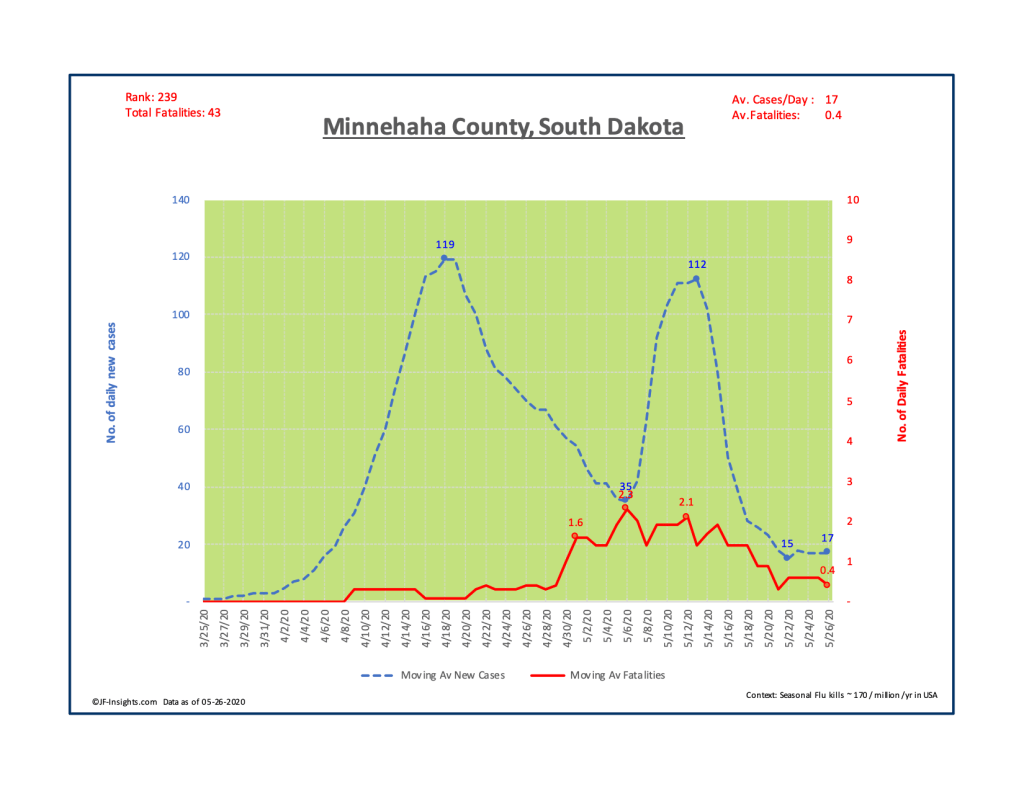
Let’s ask the question – are the implied fears on the reporting of Micro Clusters founded? Answer – largely not. Fatalities in Minnehaha county rarely exceed an average of about 2 per day – at the peak – and currently are at a level of about 0.4 per day. In total 43 people out of a county population of 190,000 have died from COVID. That’s about 233 per million – and about 30% higher than the typical US rate of seasonal flu.
I’ve noticed that when the media reports these micro clusters – they don’t usually say “and 1% of these cases may result in fatalities“. I could be wrong – but in my view – they reporting seems to leave to the imagination a much worse outcome than 1 or 2%.
South Dakota is doing well with regard to COVID. It is ranked #40 in terms of fatalities per million of population – and overall COVID deaths are about 34% of the typical seasonal flu level. The peak in average daily deaths occurred 20 days ago – and the current daily level of fatalities is about 26% of the peak. You can see all of this data in the document below.
If there’s interest in this reporting I can share this output for all states. Let me know.
Footnote 1): The methodology used for all charts is to show 7 day moving averages. This strips out any random spikes caused by, for example, lack of full reporting over weekends etc.
