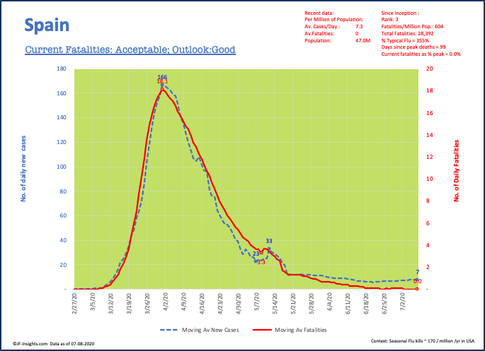
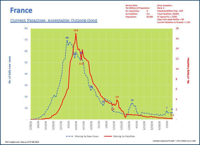
I think it can all be traced back to Memorial Day. Prior to that time – the US was enjoying a declining trend in cases and fatalities. It wasn’t moving as quickly as some of the European countries – but it did not experience the same peak wave that affected those countries.
Now, those European countries continue to keep things largely on track – whereas the US has spiked, almost as though it is in a perverse race with Brazil. Check out these charts.


The US is managing to keep fatalities down ( at a level of 1.5 per million per day) . Whether the theory that this new wave of infections is amoung younger, healthier people who are better able to fight it off without hospital care and fatalies is true remains to be seen. Some states (like Arizona) have dangerously high level of hospital ICU utilization according to media reports. We’ll report back on that in subsequent posts. Already fatalties are much higher in the worst affected states.
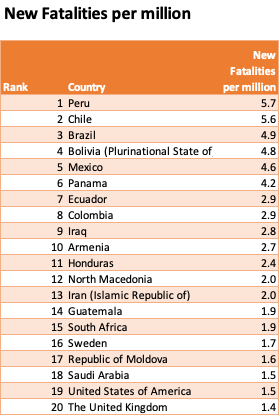
For now though, here are the top 20 countries with the current highest rate of new fatalities per million (rolling 7 day average of recently reported daily deaths). Note some of these countries may have very small populations and the data can therefore be quite volatile – but for larger countries – the data is more stable. Also take the data with a pinch of salt in 3rd world countries.