Well, after a solid couple of hours immersing myself in macros – I was finally able to automate charting data relating to Caseload and Contagious populations.
First a couple of definition. Contagious = the sum of everyone tested positive over the last 2 weeks. Caseload is everyone tested positive over the last month (i.e. includes contagious people plus everyone coping with the virus). The data assumes a 1 month period of coping – which will be different person to person – but sounds a reasonable assumption for the 3 million + cases we have been running in the US.
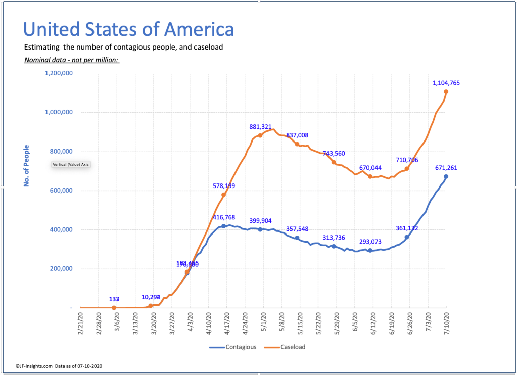
Lets look at the US picture. In early April US new cases per day peaked and then started to fall. Hence – the number of contagious people started to decrease, and eventually (after about a month) caseload started to fall.
Then around Memorial Day – we started to see cases rises. That has the effect of quickly increasing the number of contagious people (see 2nd chart – we’ve gone from 20,000 cases per day to 50,000+ within a month).
So the impact of this is that the number of people who are contagious in the US has NEVER BEEN HIGHER – its now getting close to 700,000 people. The number of people diagnosed with the virus in the past month (and therefore included in caseload) is over 1 million.

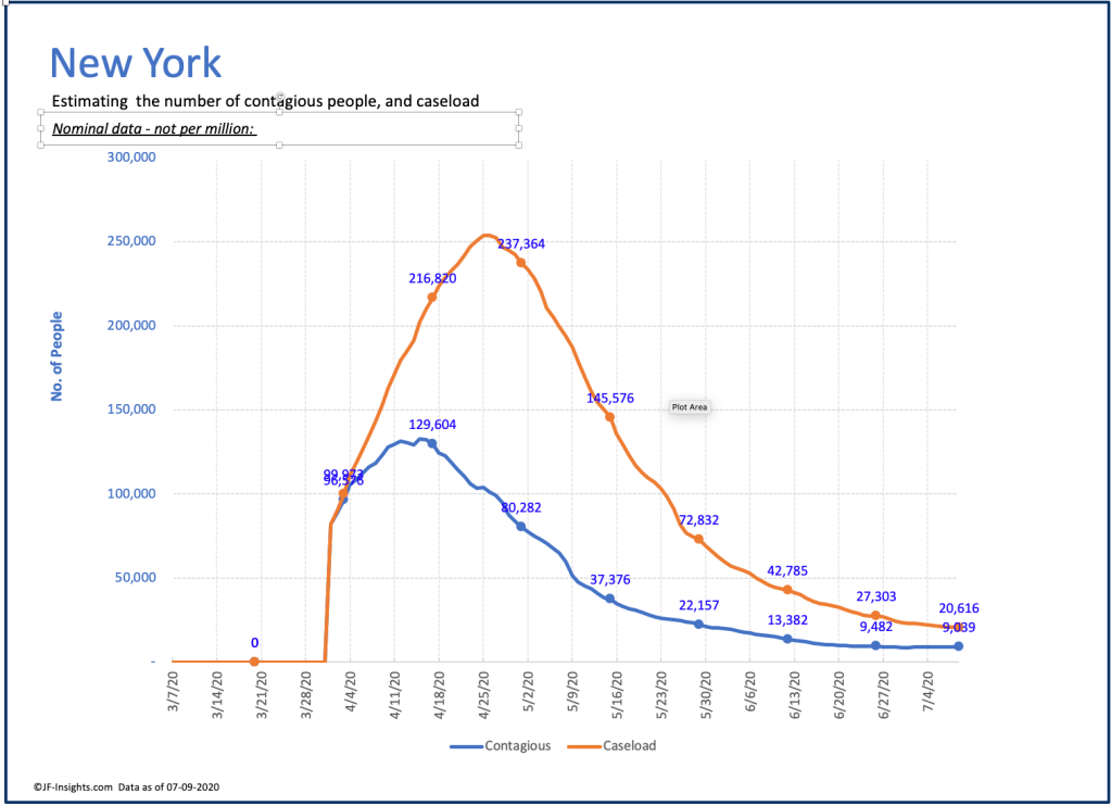
NY shows what can be done when we take this thing seriously. See below. Note caseload calculations start on day 30 in my data – so ignore the early datapoints.
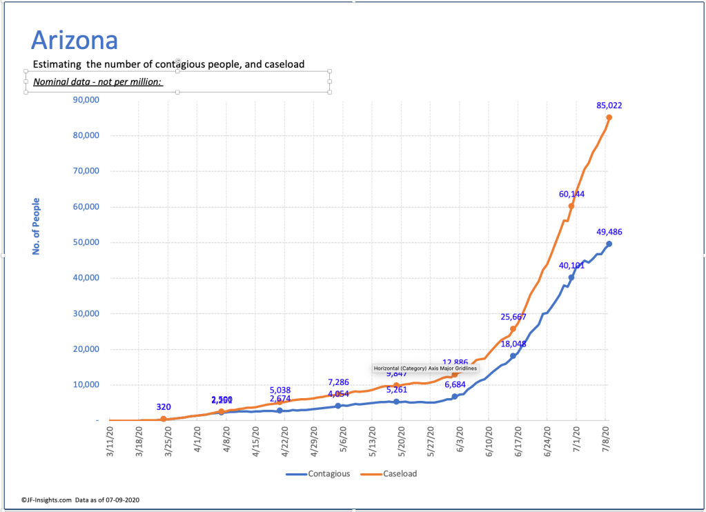
Arizona – shows what’s happening in many of the other states