
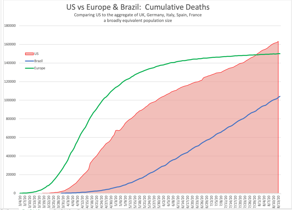
I found an interesting result from my data analysis today. On July 30th – the US and Europe were almost exactly aligned on the total number of deaths (since inception) from COVID.
In this analysis I define Europe as UK, Italy, France, Spain, Germany which conveniently has a population of 323 million – very similar to that of the US. This makes a comparison more even.
This is interesting because we’ve all know how poorly the US has been doing on a comparative scale recently, and we will see that in the charts below. But it’s very interesting that the cumulative fatalities became the same on July 30th.
We all know that Europe had a very bad start to COVID, and the US initially seemed to flatten the curve. But interesting how just a few months later than everything converged to 148,000 deaths.
Now take Brazil – on July 30th it had about 104,000 deaths – but it has a population of 208 million. So scaling it up to US size that would also be about 148,000 deaths.
3 different regions, different socioeconomic statuses, roughly the same number of deaths from COVID (when adjusting for population size) at the same point in time.
Daily Average Cases
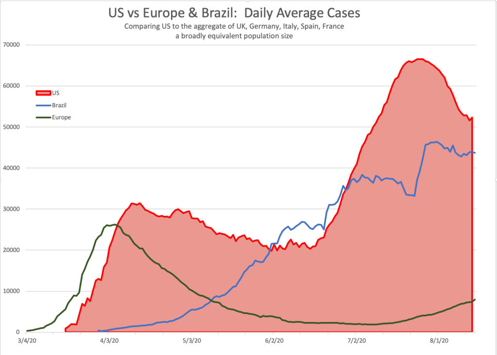
No cause for complacency though. Today Europe is in a much better position than US or Brazil. Even though European numbers have increased significantly in the past month (see green line), these are a fraction of those in the US and Brazil.
Its easy to see from this chart that the area covered by the US curve is much larger than that of Europe. That’s also evident in the data that says that US has had over 5 million cases of COVID, Brazil 3.2 million. The European total (as defined above) is 1.3 million.
Daily Average Deaths
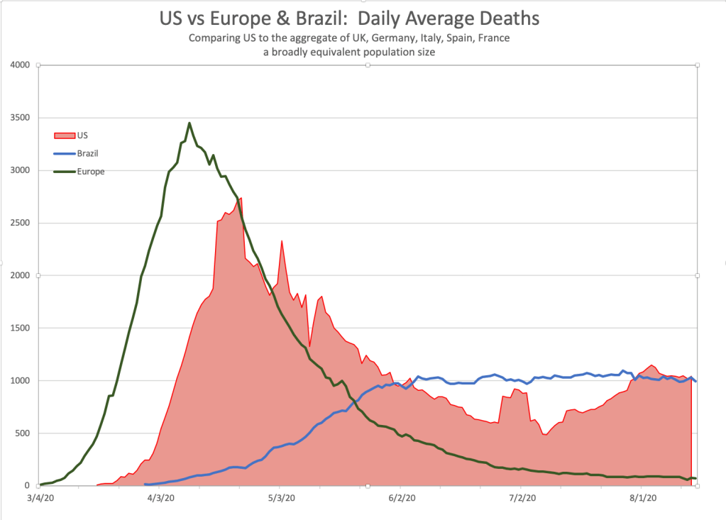
This chart shows the peak of the crisis that Europe endured early on – rising to almost 3,500 deaths per day in early April. Now however deaths per day are less than 100 per day.
By contrast – the US never hit the same peak as Europe (peak average was 2700 on April 28th) – but did not succeed in getting the numbers down. The lowest average daily deaths in the US was 484 on July 8th.
Since then US daily deaths are now averaging around 1,000 per day and no indication of any downward trend.
Remember in this analysis – the European countries in aggregate are equal to that of the US – and then look at how different the current situation is (the right hand side of the chart).
As bad as the US data has been, it really took until the end of July for the US to catch up with Europe on the total death count from COVID.
That’s not a view we hear on the main stream media.
However the data at this point shows the US COVID problem currently is multiples of that of Europe. We have much work to do.
