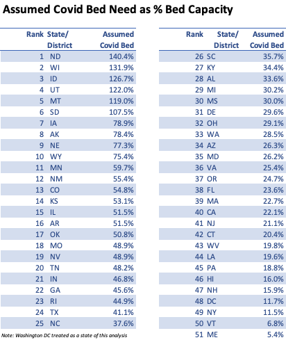
Looking at the case data – and making some assumptions about the duration of a covid infection and the percentage of people needing hospitalization (based on early NY numbers)- I’ve come up withthe above chart.
This may be a slightly pessimistic view, perhaps fewer people need hospitalization than these predict. But its probably directionally correct.
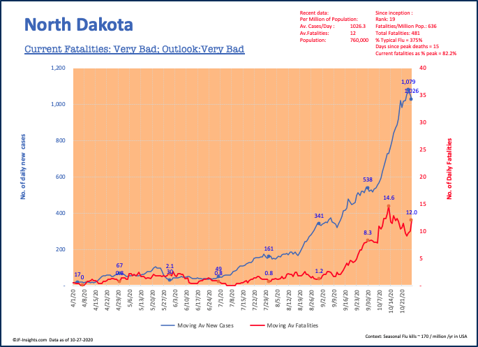
North Dakota leads the way. Population 0.76 million – currently averaging 780 new cases per day and 9 deaths per day. Expressed in per million terms – to facilitate easy comparions across all US states, it is at 1,032 cases per day – and 12 deaths per day. Those measures are the highest in the country.
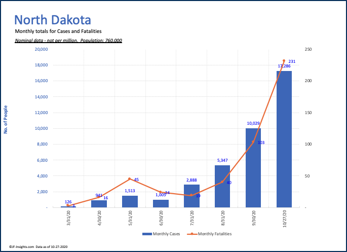
In October (to the 27th) ND recorded 17,286 new cases. That’s about the same as the prior 3 months combined.
This is the ND chart since inception. As you can see – it has never been higher:
The same picture across most of the country
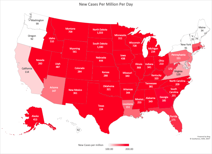
What’s concerning about this picture is truly the number of states with acceptable or low levels of covid is very small. Maine, Vermont, Washington, Oregon. I’ve been consistently running this map – and it has never looked this bad.
Texas as an example had its major COVID wave in July. It eventually got that ‘under control’ bringing daily cases to about 114 per million per day. Shortly after Labor Day – things started to get out of control. Its now as bad as it was at the begining of July and on an upswing – about 220 cases per million per day.

As the media have correctly reported – when these rising numbers get to the point where hospitals cannot handle the volume of patients, this could significantly increase the fatality rate – which, for now at least, is not rising in proportion to the cases.
