
When I started this blog, my goal was to let the data do the talking. In the early days of COVID this blog represented the very low risks of COVID in many states at a time when the media was only focused on epicenters. Now its time to bring the data to the table again – and fact check the perception that we’ve turned a corner. We haven’t.
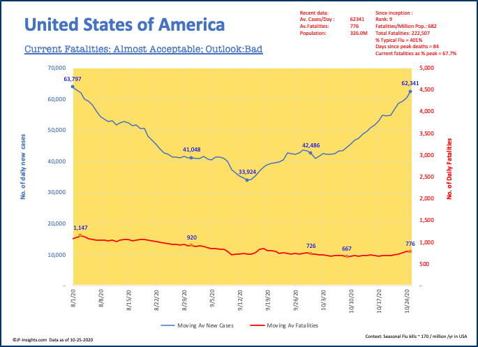
Lets look at this. In mid September – just before the Labor Day holiday impact could be reflected in the numbers – the average daily number of new COVID cases was 34,000. Currently we are close to twice that (62,000 daily case average) and the number is rising strongly (Oct 25th saw 82,630 new cases).
Its true that the fatality curve has not risen as quickly – YET – but this is still too early to conclude that.
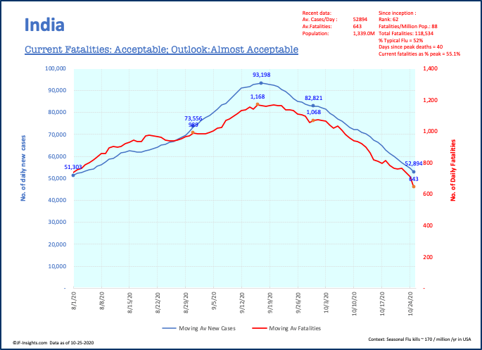
I used to compare INDIA to the US. India has a much bigger population than the US at about 1.3bn people – and for a while was heading to a point where it would be the world’s #1 in terms of total COVID cases. Now the data in India is pointing to lower numbers than the US. From a peak of about 93,000 average daily new cases in mid September to 53,000 currently.
Worst Counties in America
I’ve been tracking this data at the county level for some time. In September I reported the best numbers I’ve tracked in a while. Only 75 counties with population over 100,000 had over 200 cases per million per day. This was the blog “Reasons to be positive”.
Today – we have totally shot past that number and there are 240 counties with elevated covid rates (using the same criteria).
As an example – TEXAS – a state previously badly affected by COVID – had only 4 counties with high levels of COVID cases on 9-9-20. Today – 17 counties have elevated levels.
Illinois – had 6 counties on my list on 9-9-20. Today it has 20.
The county level data proves that COVID is spreading on a much wider basis than a month ago.
Here’s the list:
Data Denial
The path of wrong decisions often starts with Data Denial. If we can’t all see the same data and agree on what that tells us – then obviously our actions are not going to be aligned or effective.
If you live in one of the counties with elevated COVID levels – protect yourself. Wear a mask, social distance etc.
