Check out the experience of France as reflected in the chart below. Cases now are approximately 3x higher than the level in January.

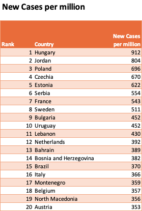
If we look at the league table for global new cases, many European countries occupy the top spots in the league tables. A common factor in these countries; low rates of vaccination. Hungary has about 6% of its population fully vaccinated against covid. France has about 3.8% of its population fully vaccinated.
UK
The UK has taken a different approach to vaccination. Over 29 million people have received at least one shot. 87% of those 50 years old and over have received at least one shot. As we can see below, this approach is paying off.
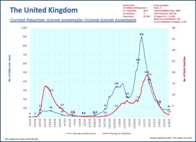
These two charts really illustrate the importance and impact of vaccination. France had its year end spike peak sooner than the UK – but the UK has delivered sustained reduction in cases and deaths. Notice the current per capita fatality rate in the UK is 1/5th that of France.
US
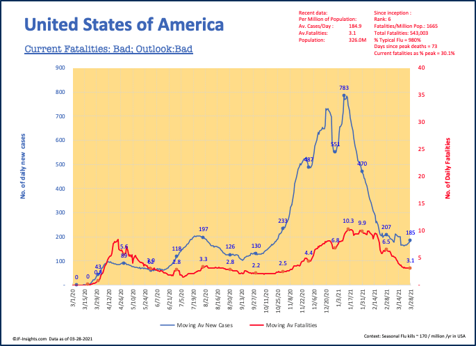
The US appears much better than Europe but not quite as successful as the UK. Current fatality rate is about 3x higher than the UK – but, most importantly has fallen very significantly since the begining of the year. 14% of the US has been fully vaccinated.
Brazil
Brazil has reached new highs for covid infections and fatalities. Fatalities are sharply rising. This is a population of over 200 million people. As of early March only 2% of the population had been vaccinated.

Putting this in raw numbers, Brazil has an average of 77,000 new cases per day, and 2300 deaths per day.
Israel
While Israel has a population of only 9m people, this has become a good case study for vaccine rollout. The country began rollout of vaccines on December 19th 2020. To date, over 50% of the population has been fully vaccinated, and for those aged 70-79, 91% have been fully vaccinated. This proactive approach shows in a much lower rate of COVID.
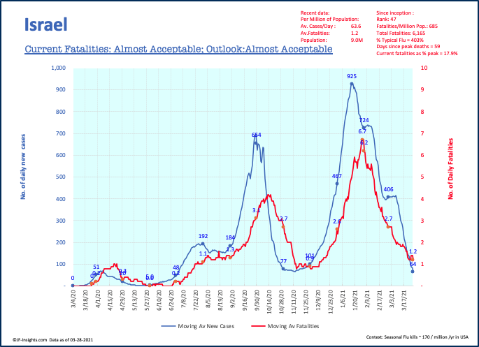
This chart also shows the clear linkage between cases and fatalities. The month of March has the lowest number of total cases since September (with the exception of November).
Conclusion
The race is on to vaccinate. The data could not be clearer. Higher vaccination rates (particularly of vulnerable segments of society) are having a material impact on rates of new infections and deaths.


The heat map shading on the respective charts is slick. I’m assuming current fatalities and outlook are based on moving averages, which would be a cool way to summarize and project progress. Biggest takeaway was the UK’s vaccine success – 87% over 50 y/o is amazing.
LikeLike