
Building on from my 2020 year in review for COVID performance I thought it would be interesting to look at the party that held the governorship during the crisis. Generally to pose the question as to whether there is, or is not a pattern. Do you think democratic or republican governors performed better?
Here’s my analysis. I’m looking at the percentage of total state deaths that occurred in Q4. The reason for this is that we can’t hold states responsible for factors outside of their control – such as the rapid proliferation of the virus at inception. So – taking a look at Q4 – gives an opportunity for all states to have enacted controls to mitigate COVID spread.
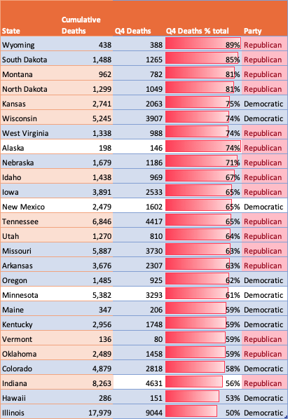
Here’s what the data shows:
Of the top 20 states where the Q4 percentage of deaths us the highest, 13 of these are led by Republican Governors.

That is for this population of top 20 – republican states practically outnumber Democratic states 2 to 1. 13 republican versus 7 democratic.
85% of all covid deaths in South Dakota took place in Q4.
Readers of this blog can find my posts reporting the status in North and South Dakota – both Republican. I was especially shocked when North Dakota enacted their crisis management plan to allow hospital workers who are positive with COVID to treat patients. The lack of timely action in this state resulted in Q4 being a disastorous quarter for COVID. South Dakota was no better.
Speaking about the data
No data set is perfect, and neither is this one. One potential flaw in the data is that states which were very badly hit in Q2 (i.e. New York, Illinois both Democratic) had such a high number of deaths then, that it possibly gives them an advantage in this statistic. A high number then, means that Q4 numbers are lower as a percentage. That’s possible.
But lets play with that for a bit. New York (population 19m, Democratic) recorded 4800 deaths in Q4. That’s a lot – and would put it #7 of all states for deaths in Q4. That’s a Q4 percentage of total deaths equal to 13%.
Compare that to Tennessee (population 6.7m, Republican) that recorded 4417 deaths in Q4. That represented 65% of all deaths for the state.
For sure – NY while hit worse at the inception of the crisis – performed better in Q4 than Tennessee. The per capita numbers bear this out.
The #1 state for most deaths in Q4 -Texas (Republican) recording over 12,000 deaths – across a population of 29m. #2 is California (Democratic) with 10,000 deaths on a population of 39 million – a much lower rate of deaths per capita.
If you can think of a better way to measure performance – show us! But on this lens at least there’s a clear linkage.
States led by Democratic Governors have performed better in the later stages of 2020.
Lets look at the representatives who refused to wear face masks on Jan 6th when sheltering in the secure location – and a few data points from me:
- Georgia Rep. Marjorie Taylor Greene, (with over 800 new cases per million per day you would think she would be better informed!)
- Oklahoma Rep. Markwayne Mullin, (OK has over 970 new cases per million per day – again one of the highest in the Nation)
- Arizona Rep. Andy Biggs, (the highest current fatality level in the nation, and the highest new case levels)
- Pennsylvania Rep. Scott Perry, (one of the highest current fatality levels of all states)
- Texas Rep. Michael Cloud and (one of the highest rates of new COVID cases)
- California Rep. Doug LaMalfa (really this giuy should no better – with over 500 deaths from COVID per day in California – the decision not to wear a mask is disgraceful)
One of the things that’s impressive about the list is the absence of North and South Dakota. Finally the message is getting through!!
Here are some pictures of the current status across the US. I had to put in the PURPLE color as I need some level to indicate something way above what I’d consider to be RED. Take a look:
Current Average Daily Fatalities per capita
Notice Arizona leading the nation – tell that to Andy Biggs

Current Average Daily New Cases per capita

Fatalities per capita since inception
Take a look at this chart and tell me how it makes any sense, that North and South Dakota have any place in the top 10 states based on total fatalities per capita.

For the data junkies
Here’s the full list of states (plus Washington DC) ranked in descending order of fatalities per million (as of Jan 15th 2021). Yes, the top 2 states are democratic and have the highest level of fatalities across the nation. But – take a closer look – all of those deaths were at the inception of the crisis. In Q4 – the total number of deaths were less than 15% of the total for the year.Massachussets (Republican) also performed well.
But from the data on North and South Dakota – we see 2 states in the top 6 that really should not be there. Well over 80% of all deaths for the year occurred in a single quarter.

Another interesting observation is that for the bottom 10, or bottom 20 states on this list, each data snapshot is 50/50 republican v democrat. So there are actually some good leaders out there – irrespective of party line.
Final word
There are 26 states where 50% of their total deaths occurred in Q4. 16 of these were led by republican governors.
| State | Cumulative Deaths | Q4 Deaths | Q4 Deaths % total | Party |
| Wyoming | 438 | 388 | 89% | Republican |
| South Dakota | 1,488 | 1265 | 85% | Republican |
| Montana | 962 | 782 | 81% | Republican |
| North Dakota | 1,299 | 1049 | 81% | Republican |
| Kansas | 2,741 | 2063 | 75% | Democratic |
| Wisconsin | 5,245 | 3907 | 74% | Democratic |
| West Virginia | 1,338 | 988 | 74% | Republican |
| Alaska | 198 | 146 | 74% | Republican |
| Nebraska | 1,679 | 1186 | 71% | Republican |
| Idaho | 1,438 | 969 | 67% | Republican |
| Iowa | 3,891 | 2533 | 65% | Republican |
| New Mexico | 2,479 | 1602 | 65% | Democratic |
| Tennessee | 6,846 | 4417 | 65% | Republican |
| Utah | 1,270 | 810 | 64% | Republican |
| Missouri | 5,887 | 3730 | 63% | Republican |
| Arkansas | 3,676 | 2307 | 63% | Republican |
| Oregon | 1,485 | 925 | 62% | Democratic |
| Minnesota | 5,382 | 3293 | 61% | Democratic |
| Maine | 347 | 206 | 59% | Democratic |
| Kentucky | 2,956 | 1748 | 59% | Democratic |
| Vermont | 136 | 80 | 59% | Republican |
| Oklahoma | 2,489 | 1458 | 59% | Republican |
| Colorado | 4,879 | 2818 | 58% | Democratic |
| Indiana | 8,263 | 4631 | 56% | Republican |
| Hawaii | 286 | 151 | 53% | Democratic |
| Illinois | 17,979 | 9044 | 50% | Democratic |
Here is the same data but formatted more nicely:
The more I look at it – the more I think democratically led states performed better in 2020. What do you think?
